My Weather App Study
Role: UI Designer, prototyping
Scope: Personal Mobile Interface Exercise (Figma)
Context
In April 2024, it was like 3 months I had been initiated to Figma. I still weren't a Figma girl... so I decided to explore the vast UI design world through the good old art of "copying". I found out an interesting fully-guided tutorial on YouTube, and I gave it a try.
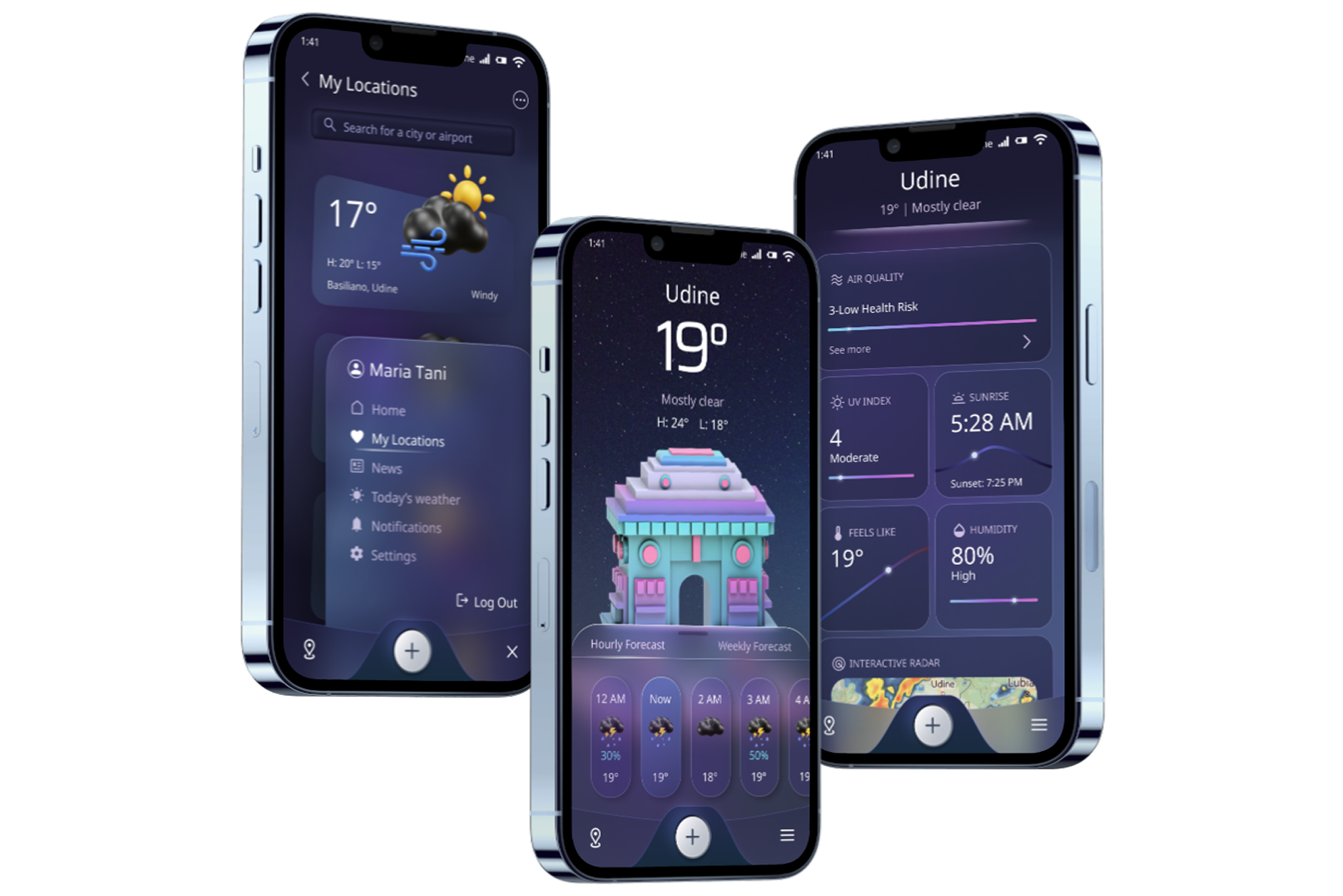
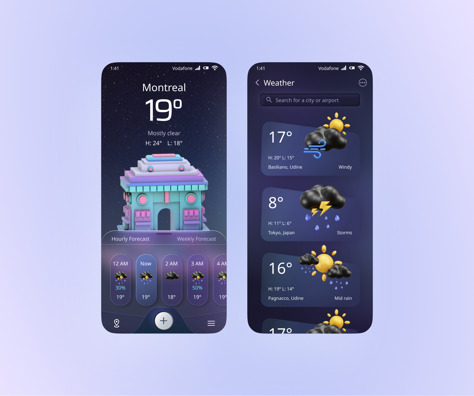
At that time, Glassmorphism was considered an "experimental" or niche aesthetic for many designers. This study allowed me to explore its potential loooong before it became the dominant 2025-2026 trend ("Effects > Glass" in Figma didn't even exist!). Ahhh the magical "Liquid glass": now massively omnipresent thanks to iOS and worshipped by everyone, yet microscopically - or not at all - compliant with A11Y standards!
Snapshots & annotations
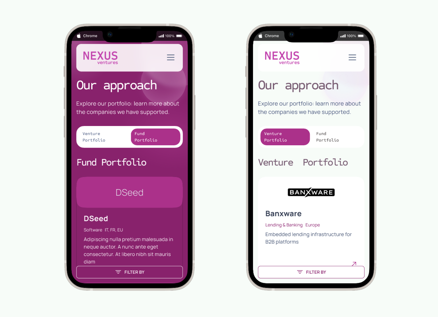
The main design hook is the engaging switch pattern: the bold Byzantium purple background alternates with the minimal white, facilitating content scanning and increasing users wonder.
The website is designed with responsiveness in mind, ensuring content remains usable across devices and screen sizes. All interactive elements clearly communicate their purpose and state through proper naming and, during the design handoff phase, we added comments for the developers to guide them in implementing semantic markup and ARIA attributes where needed.
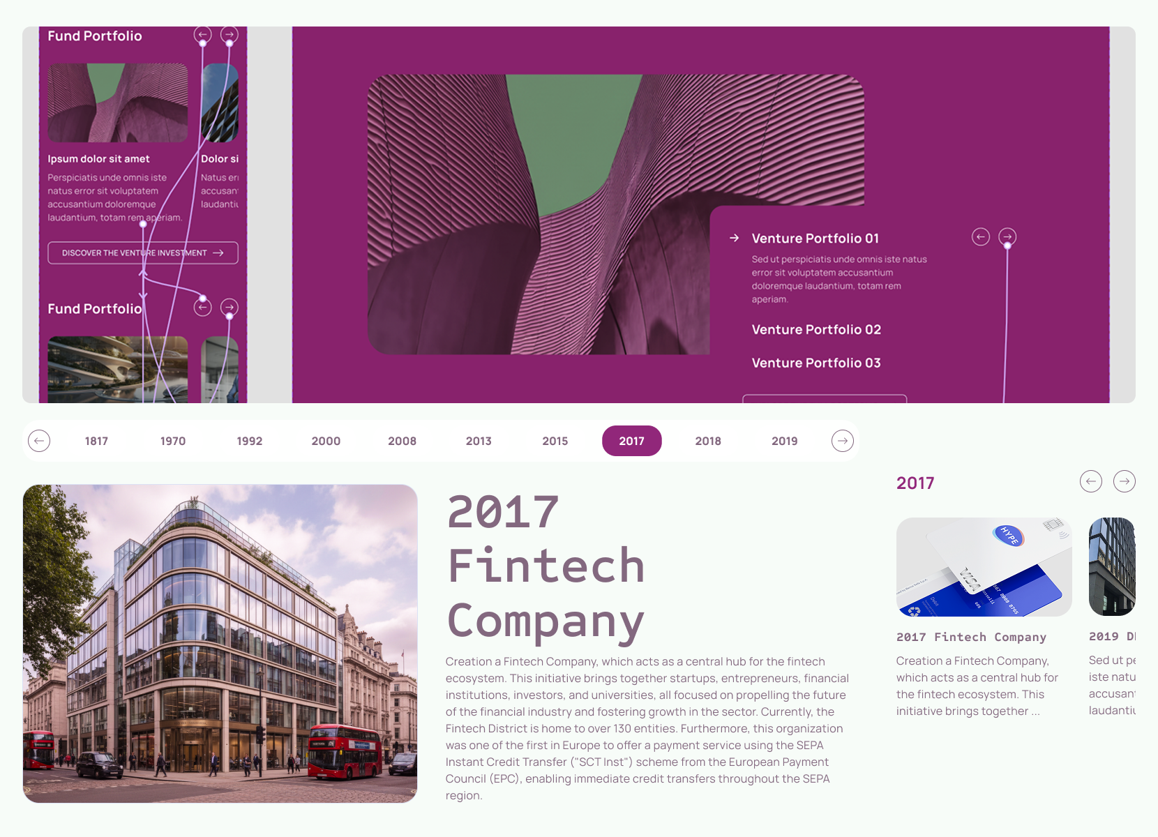
The carousel component is fully accessible, supporting swipe gestures on mobile devices as well as keyboard and click interactions on desktop. It provides multiple control options, including navigation arrows and clearly labeled buttons, to accommodate different user preferences. We added the focus states to each interactive component (meeting WCAG criterion 1.4.11 - color contrast of at least 3:1 against the background) to ensure that keyboard users can easily identify which element is currently selected, and we clearly designed the states for the developers to implement.
At first, we created a more disruptive version of the UI, esploring alternatives to the main group brand kit, to give a fresh, modern look to the layout. After various iterations, we settled on a balanced approach - with light background - that maintains usability while introducing innovative elements and improved user experience.